Most property videos are assembled in gallery order, which is usually the order the photographer happened to shoot in. That produces a tour that jumps from the kitchen to a bathroom to the garden and back to a bedroom, and the viewer comes away with a set of nice rooms and no idea how they fit together.
A good tour does two jobs at once: it hooks in the first couple of seconds, and then it walks the viewer through the place in an order that makes sense on foot. Here is how to do both.
The order, planned for you
siriusly.ai plans which space each shot covers from the listing photos, then films one short take per room. You set the length; the tour fits the place to it.
Try it freeOpen on the Reason to Watch
On a social feed, the first shot competes with everything else in the scroll. On a portal, it competes with the next listing. Either way, the first two seconds should be the strongest single image the property has. For most homes that is one of three things:
- The exterior, when the building itself is the draw - a period house, a striking modern facade, a front garden.
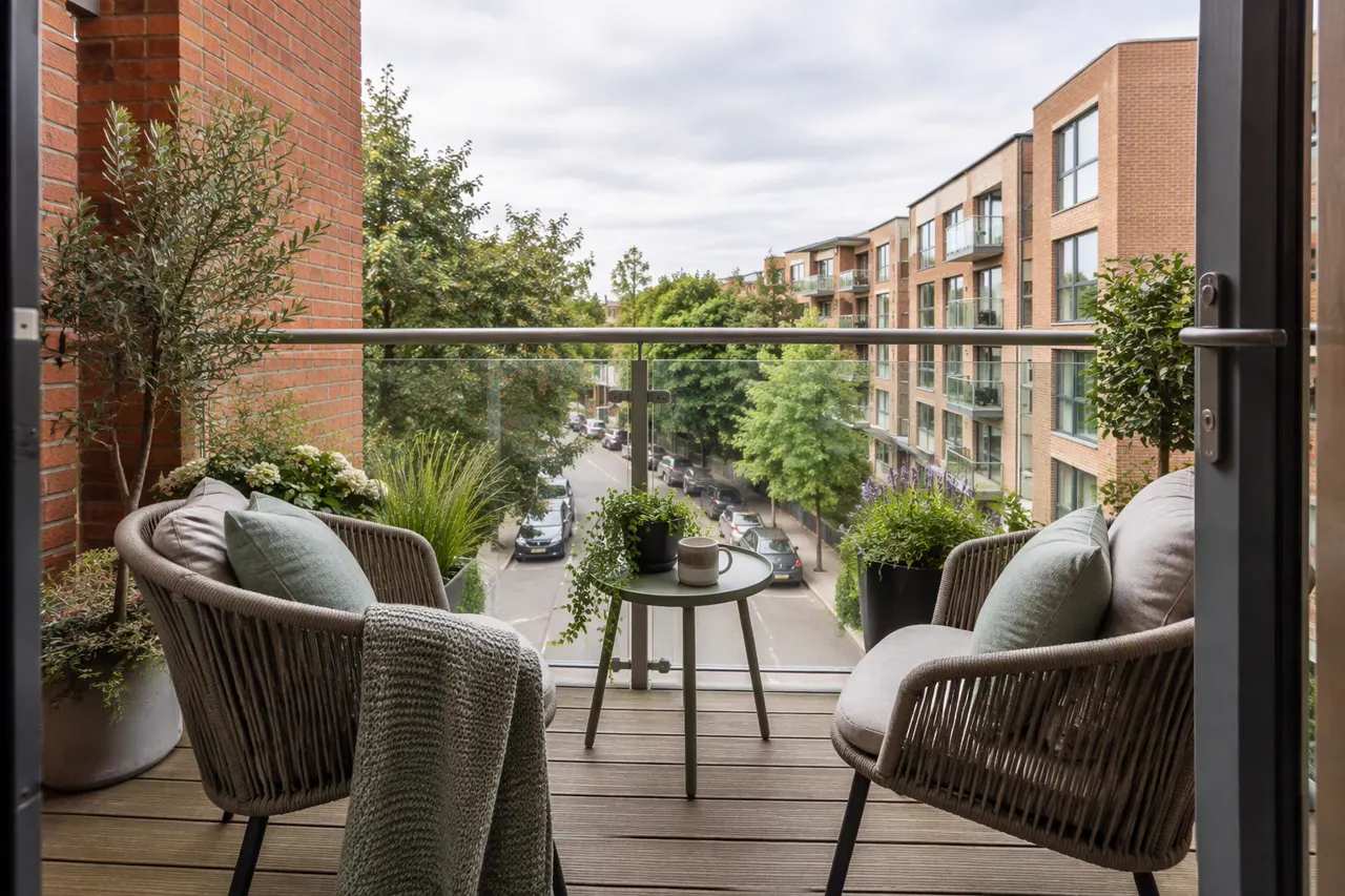
- The main living space, when the interior outclasses the outside, which is true of most apartments.
- The view or the setting, when the location is what is really for sale - the sea, the mountains, the park across the road.
Pick one and lead with it. The temptation is to open on the exterior out of habit, even when the exterior is an unremarkable apartment block. The same thinking that drives hooks in any short video ad applies here: the first frame has to earn the second.
Then Walk It Like a Viewing
After the opening, follow the route an agent would take a buyer on. The viewer's mental floor plan is built from transitions, so an order that could actually be walked is easier to follow than one that is merely ranked by how good each room looks.
- Arrival. The facade or the entrance. If you opened on the living room, this can come second as a quick establishing beat.
- Entrance and hallway. One short shot. It orients the viewer and connects outside to inside.
- Living spaces. Living room, then dining, then kitchen - the order they usually connect in.
- Outdoor space reached from them. Terrace, balcony or garden straight after the room that opens onto it, so the connection is obvious.
- Bedrooms, main bedroom first.
- Bathrooms, only the best one or two.
- Close. The garden, the view, the street or a second look at the strongest room.
How Long Each Space Gets
One space per shot, and each shot long enough for a slow camera move to register - roughly three to five seconds. Shorter and the cuts feel frantic; longer and a silent shot of a bedroom starts to drag. That makes the length of the video a decision about how many spaces it shows:
| Length | Spaces shown | What fits |
|---|---|---|
| 15 seconds | 3 - 4 | The hook, the main living space, the kitchen, one closing shot. A teaser, not a tour. |
| 30 seconds | 6 - 8 | Every main space once, plus an exterior. The right length for most social placements. |
| 60 seconds | 12 - 15 | A full tour, with a second angle of the main rooms, a detail shot or two, and the surroundings. |
If a longer video runs out of distinct rooms, it is better to show a second angle of the living room than to pad with a utility room. Repetition of a great space is less damaging than attention spent on a dull one.
What to Leave Out
A tour is an edit, not an inventory. Leave these out unless they are a selling point in their own right:
- Separate toilets, utility rooms and storage cupboards.
- The garage, unless it is unusually large, converted or the buyer group cares (workshops, car collectors).
- A third and fourth bathroom that look like the first two.
- Near-duplicate photos of the same room from almost the same spot - one of them is enough.
The full gallery is still on the listing for anyone who wants the inventory. The video's job is to get them to open it.
Where the Surroundings Go
Photos of the street, the neighbourhood, the town or the coastline are not of the property, which makes them powerful bookends and poor fillers. Put them at the start when location is the hook, or at the end as the closing beat. Never in the middle, where a beach between the kitchen and the bedroom reads as a confusing cut rather than context.
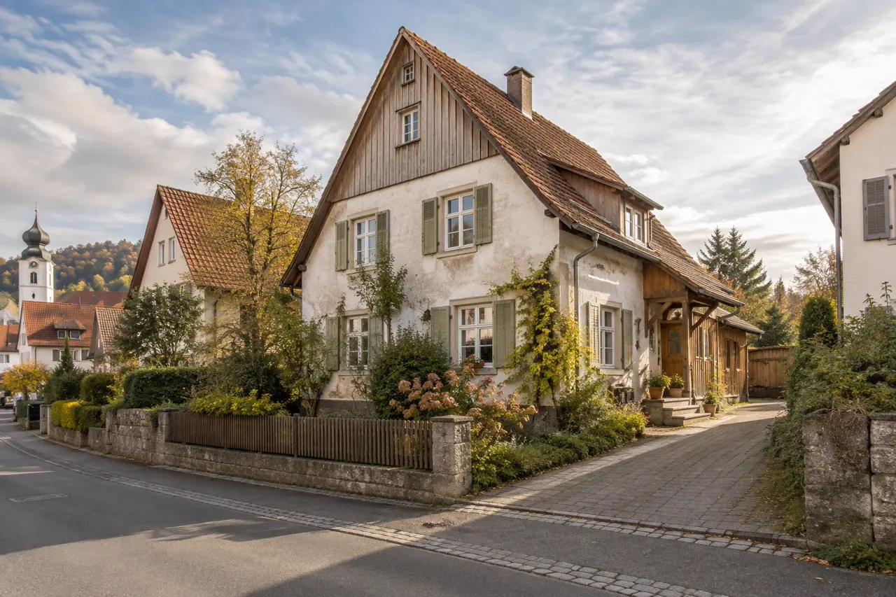
For some properties - a small apartment in a sought-after area - one or two surroundings shots are worth more than another room. For others, every second belongs to the place itself, and a second angle of a room is the better use of the time.
Commercial Property Runs in a Different Order
A business buyer or tenant is checking whether the space works, not imagining living in it. The order follows how the space is used:
Office and warehouse tour order
Frontage and access: the building, the parking, the loading entrance.
Reception: what a visitor sees first.
The working space: open-plan offices, the warehouse floor, the production area - the reason the property exists.
Operations: loading bays, roller doors, racking height, yard space.
Amenities: boardroom, kitchen, facilities - briefly.
The pacing is also more matter-of-fact. A slow, atmospheric drift through a warehouse wastes the time a buyer would rather spend seeing the ceiling height and the loading doors.
FAQs
Should the tour follow the gallery order?
Only if the gallery was already ordered as a walk-through. Most are not. Reordering costs nothing and makes the layout legible.
Should every bedroom be shown?
In a 60-second tour of a family home, usually yes, since bedroom count is part of what buyers are checking. In 15 or 30 seconds, show the main bedroom and let the caption or the overlay state the count.
Does the order matter on a silent tour?
More, not less. With no narrator to say "and through here is the kitchen", the sequence of rooms is the only thing explaining how they connect.
Where should the price and key facts go?
On an overlay that stays readable over the whole video, or as a card at the end. Not as the opening shot - the first frame is for the property, not the spec sheet.